


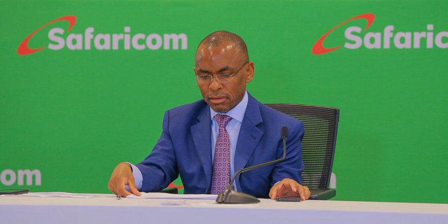
Kenyans on Twitter (KOT) have shared their varied opinions concerning the new Safaricom logo.
The company has rebranded in line with attaining 20 years since its founding from Telkom Kenya.
The new logo whose underlying concept is an arrow that points upwards or forwards in the mix of its corporate colors Green, White and Red seems to have not impressed KoT.
New Safaricom logo and BBI launching on the same day. Pure coincidence that spells tyrannnnnnyyyyyyyy
Oppressive logo, oppressive company, oppressive document
— mumbi. (@miss_mumbz) October 26, 2020
Issa No for me….. 🤔
— Lindah Oguttu (@lindahoguttu) October 26, 2020
Me too! The red is an eyesore
— Phannie A. Kwegah 🇰🇪 (@MissKwegah1) October 26, 2020
Extremely ugly. As a shareholder wondering how many millions were spent on this atrocity to the eyes
— Jackson Omari (@jaco78) October 26, 2020
It looks like a certain herbal toothpaste.
— #LandFirst Mwalimu Wandia (@wmnjoya) October 26, 2020
Nobody:
Safaricom: Google has new colors for their icons. perhaps it's time we do the same https://t.co/Ab21j1HHJQ
— Kharioki⚛ (@kharioki) October 26, 2020
Yeah.
This thing is super ugly.
Thanks. https://t.co/CCxaihyfRu
— Wordslinger {Kas Ka Gan} (@Wordslinger__) October 26, 2020
I wonder if they tested this before unveiling it because what in the ghetto? Ama they paid the focus groups in bundles 😂😂😂😂😂? We thought Simple. Transparent. Honest. was interesting but heh https://t.co/d7iRpffZLp
— Lucy E. Wanjiru (@LucyNdinguri) October 26, 2020
This has not been received well.
Despite the sentiments, Safaricom says there a ‘big reveal’ tomorrow and that Kenyans should wait.
Kenyan Business Feed is the top Kenyan Business Blog. We share news from Kenya and across the region. To contact us with any alert, please email us to [email protected]


